
What’s your email ritual? When do you settle into your inbox? Is it the first thing you do when you sit at your desk? Or do you get a head start by checking them on your way to work, or while….performing your morning ablutions? Answers on a postcard, (or in the comments) please.
If the stats are anything to go by, it’s safe to assume that many people open their emails away from their desks. Mobile opens account for 46% of all email opens. So it only makes sense that email marketers prefer mobile-friendly and responsive email design. But which is best? We’ll look at examples of both mobile-friendly and responsive email designs with an illustration of the key differences to empower you to make the best decision for your business.
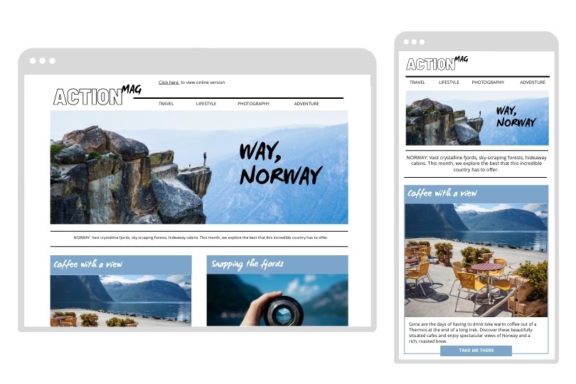
Responsive email design example:
Responsive emails change their layout depending on how wide the screen is (and other parameters that you define). A common change in responsive email design (as seen in the example below) is when a two-column layout (in desktop mode) changes to a single column layout (mobile mode) so that users don’t have to zoom in and pan around to navigate the email.
Notice how the text changes to fit the screen. You can also change font sizes to make the text more readable on a smaller screen.
Pros
- You have way more control over your design. You can choose more dynamic layouts for desktop, and you can control the exact parameters for your design to shift, optimizing it for both desktop and mobile.
- It is supported by Gmail and most other email services. As of September 30, 2016, Gmail supports responsive emails.
Cons
- The development process is more costly in terms of time and resources. You need to get a coder that knows what they’re doing.
- Not every device and email client supports it.
- It can be glitchy, and frustrating for your reader when it does glitch.
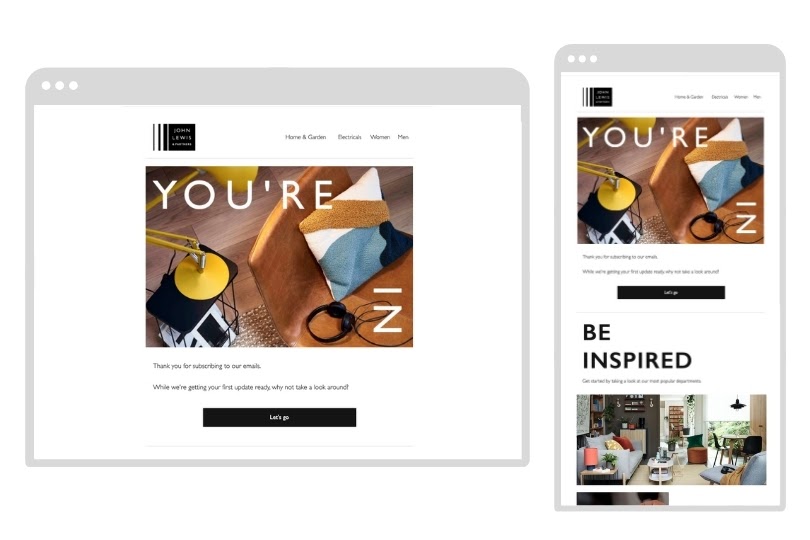
Mobile-friendly email design example
Mobile-friendly email designs are sometimes also referred to as “mobile-first”. They are usually a single-column layout with larger text, = larger calls to action, and images with email-friendly dimensions.
These emails look the same on all devices.
In the past, the disparity between desktop and mobile dimensions meant that mobile-first emails sometimes looked awkwardly large on desktop. However, since mobile screen sizes have grown hand-crampingly enormous, mobile-first emails are now far more attractive on all devices.
Pros
- Far more simple and quick to design and code. It’s a case of making one simple, elegant design.
- Supported by all devices and email clients. You don’t need to worry about whether or not your audience is using an email client that supports media queries.
- Less glitchy
Cons
- Fewer design options. You’re quite limited in your layout options. But with a little creativity, single-column layouts can be made to look more dynamic.
- Not technically optimized for either desktop or mobile (it’s somewhere in between)
So which should you choose?
If you’re on a limited budget or don’t have access to A-grade developers, then mobile-friendly design is your safest bet. You can use mobile-first design for the majority of your emails and reserve responsive email for special campaigns, or specific newsletters (such as to showcase your new range of products).
Ultimately it’s up to you and the resources at your disposal. If you’re unsure as to where your next marketing investment should go, get in contact. We’ll analyze your business and advise you on how to make your next investment go the furthest.